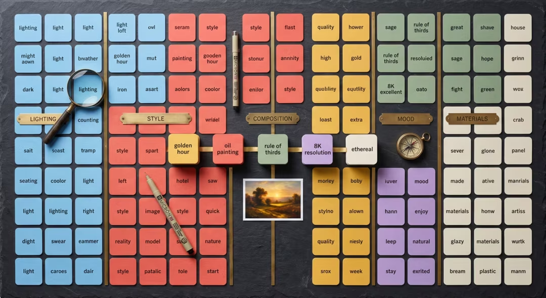
Modifiers are the adjustment layer of prompting. They will not rescue a vague description, but applied to a sound one they are how you move an image from acceptable to intentional.
Use three to six per prompt. Add them one at a time. Every table below is grouped so you can pick one term from each row you need.
Key takeaways
- Lighting terms move an image more than any other category.
- Lens language compactly encodes perspective, depth and distance.
- Artist-agnostic descriptors give more control than artist names, and avoid imitating living practitioners.
- Different models weight these terms differently, so re-test when you switch tools.
- Three to six modifiers is usually the productive range.
Lighting
| Group | Terms | Use when |
|---|---|---|
| Quality | soft diffused, hard directional, dappled, flat even | Setting the overall gentleness or drama |
| Direction | side light, backlit, rim light, top light, under light | Shaping the subject's form |
| Natural sources | north window light, overcast daylight, golden hour, blue hour, moonlight | Anchoring time and place |
| Artificial sources | single softbox, tungsten practical, sodium street lamp, neon spill, candlelight | Interiors and night scenes |
| Contrast | high contrast, low contrast, deep shadow, lifted blacks | Controlling mood without changing colour |
Lens and camera
| Group | Terms | Effect |
|---|---|---|
| Focal length | 24mm, 35mm, 50mm, 85mm, 135mm, macro | Perspective and apparent distance |
| Aperture | f/1.8, f/2.8, f/5.6, f/11 | Depth of field |
| Sensor and format | medium format look, 35mm film, large format | Detail rendering and depth character |
| Technique | tilt-shift, long exposure, handheld, tripod | Geometry and motion handling |
| Grain and finish | fine grain, coarse grain, clean digital, halation | Realism cues |
Composition
| Group | Terms |
|---|---|
| Shot type | extreme close-up, close-up, medium shot, full body, wide establishing |
| Angle | eye level, low angle, high angle, overhead, dutch tilt |
| Placement | centred, rule of thirds, off-centre, negative space left |
| Depth | foreground element, layered depth, flat compression |
| Framing | framed by a doorway, through foliage, over the shoulder |
Style and medium
| Group | Terms |
|---|---|
| Photographic | documentary, editorial, reportage, still life, catalogue |
| Painted | gouache, oil on canvas, watercolour wash, ink and wash |
| screen print, risograph, letterpress, lithograph, halftone | |
| Drawn | graphite, charcoal, technical pen, coloured pencil |
| Digital | flat vector, isometric, 3D render, cel shaded, painterly digital |
Mood and atmosphere
| Register | Terms |
|---|---|
| Calm | quiet, still, contemplative, unhurried, spacious |
| Warm | intimate, domestic, nostalgic, companionable |
| Cool | austere, clinical, detached, formal |
| Tense | oppressive, claustrophobic, unsettled, watchful |
| Energetic | bustling, kinetic, chaotic, celebratory |
Texture and surface
| Group | Terms |
|---|---|
| Skin | visible pores, fine lines, freckles, unretouched, natural sheen |
| Fabric | slubby linen, brushed wool, waxed cotton, worn denim, raw silk |
| Hard surfaces | brushed metal, patinated brass, chipped enamel, board-marked concrete |
| Natural | weathered timber, moss, lichen, cracked clay, wet stone |
| Paper | cotton rag, newsprint, uncoated stock, deckled edge |
Colour palette
| Group | Terms |
|---|---|
| Temperature | warm cast, cool cast, neutral, split-toned |
| Saturation | muted, desaturated, rich, high saturation |
| Named palettes | earth tones, sage and cream, ochre and charcoal, teal and rust |
| Limits | two-colour, three-colour, monochrome, duotone |
| Print behaviour | ink misregistration, overprint, spot colour |
Movement
| Group | Terms |
|---|---|
| Frozen | strobe-frozen, crisp action, mid-stride |
| Blurred | motion blur, panning blur, long exposure trails |
| Implied | fabric mid-turn, hair lifted, dust disturbed |
| Camera | handheld shake, steady tripod, tracking shot feel |
Editorial direction and artist-agnostic descriptors
| Instead of naming an artist | Describe |
|---|---|
| A painterly look | visible brush marks, soft edges, limited palette, canvas texture |
| A vintage look | period-appropriate clothing, faded dye colours, film grain, slight vignette |
| A graphic look | flat shapes, hard edges, restricted palette, generous margins |
| A cinematic look | anamorphic framing, motivated light source, shallow depth, muted grade |
| An illustrative look | variable line weight, simplified forms, selective detail |
A potter cleaning her hands at a stone sink, soft north window light, 50mm at f/2.8, muted earth tones, visible clay residue and skin texture, documentary photograph
Five modifiers: light, lens, palette, texture, medium. That is usually enough.
A simplified harbour scene as a two-colour screen print, deep teal and warm cream, visible ink misregistration, coarse paper grain, flat shapes, generous margins, no text
Print modifiers work best in groups because they describe one coherent process.
Same scene and framing, but change the mood only: overcast light, cool cast, low contrast, still and unhurried, everything else identical
Isolating one category is the fastest way to learn what these words actually do.
Model-specific notes
Midjourney treats style and medium terms strongly, so a single word can dominate. FLUX.2 responds better to the lens, lighting and texture columns than to abstract mood words.
Conversational tools accept all of these but prefer them in sentence form. Ideogram wants layout and typography terms alongside quoted copy rather than atmospheric language.
The register differences are covered fully in the model-specific prompting guide.
Interpretation varies
The same modifier can behave differently across models and across versions of the same model. Treat this sheet as vocabulary rather than as a guaranteed control panel.
Frequently asked questions
How many modifiers should I use in one prompt?
Three to six is usually enough. Beyond that, terms start competing and later ones often carry less influence. Add modifiers one at a time so you can see what each one does.
Do all models interpret modifiers the same way?
No. Midjourney treats style words strongly, FLUX responds better to technical description, and conversational tools prefer the same ideas expressed as sentences.
Are artist names useful modifiers?
We avoid naming living artists. Descriptive alternatives such as line weight, palette and era give more control and avoid imitating someone's living practice.
Which category matters most?
Lighting. It changes the feel of an image more than any style keyword and is the category beginners most often omit.
Can modifiers fix a bad prompt?
No. Modifiers refine a sound description. If the subject, scene, composition and light are not clear, adding style words simply decorates a vague image.
Return to the pillar guide for the complete method: iteration, model-specific phrasing, negative prompting and realism techniques.
Continue the series
The other chapters in the AI Prompt Engineering guide.