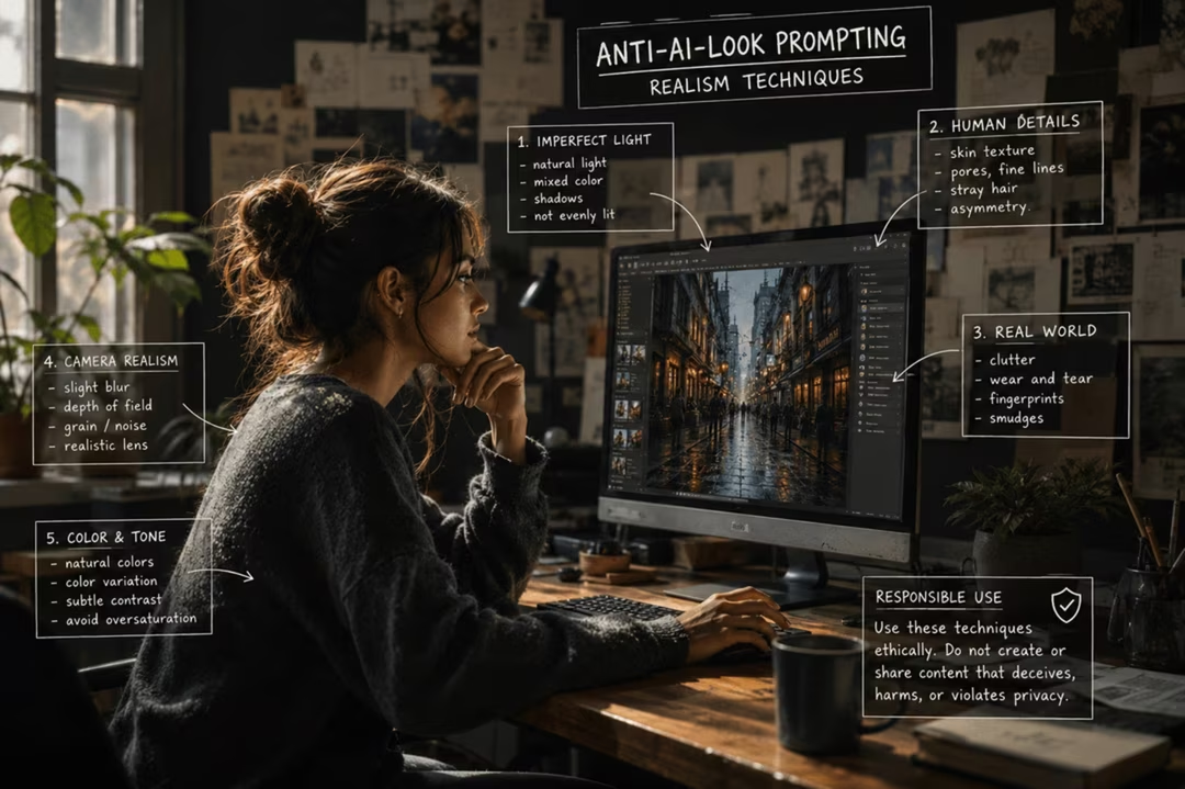
The problem with most AI images is not that they look bad. It is that they look too good in the wrong way: too clean, too symmetrical, too evenly lit, too perfectly composed.
Reality is untidy. Skin has texture, light comes from somewhere specific, framing is slightly off, and something in the background is not where a designer would have put it. This chapter is about restoring those imperfections deliberately.
Key takeaways
- Over-smoothed skin and plastic texture are the most common giveaways.
- Name a single, physically plausible light source instead of ambient perfection.
- Slightly imperfect framing reads as authentic; textbook composition reads as staged.
- Depth-of-field blur should behave like a lens, not like a filter applied to everything behind the subject.
- Realism techniques must never be used to deceive. Disclose where a viewer would reasonably want to know.
The eight common faults
| Fault | Why it happens | Prompt fix |
|---|---|---|
| Over-smoothed skin | Training bias toward retouched imagery | visible pores, fine lines, unretouched |
| Plastic texture | Uniform specular highlights | matte surface, subtle sheen, worn edges |
| Over-sharpening | Detail applied evenly across the frame | soft falloff away from the focal plane |
| Impossible lighting | Multiple unmotivated sources | single window light from camera left |
| Repeated background detail | Pattern completion | irregular background, asymmetric clutter |
| Symmetrical faces | Averaging tendency | slightly asymmetric features, natural imperfection |
| Excessive bokeh | Aesthetic default | f/4 rather than f/1.4, background legible |
| Perfect composition | Trained on curated images | slightly off-centre, casual framing |
Skin and texture
Ask for what a real face has: pores, fine lines, uneven tone, a slight shine on the forehead, stray hairs. This is the single highest-impact change in portrait prompts.
Also describe materials honestly. Fabric creases where it is worn. Metal collects fingerprints. Wood has scratches near handles. Naming one or two of these grounds the whole image.
natural unretouched skin with visible pores and fine lines, slight shine on the forehead, a few stray hairs, uneven skin tone, no beauty retouching, no smoothing
Append this to an existing portrait prompt rather than replacing your subject description.
Plausible lighting
The strongest realism cue is one motivated light source. Name it, place it, and describe what it does: "a single window at camera left, soft falloff to the right, no fill".
Avoid stacking flattering conditions. Golden hour plus rim light plus a glowing background is three impossible things at once, and the brain notices even when the viewer cannot articulate why.
Lit only by a single window at camera left on an overcast afternoon. Soft falloff into shadow on the right side of the face, no fill light, no rim light, shadows slightly cool.
"No fill, no rim" is doing real work here. It removes the studio look.
Natural camera language
Describe a plausible camera and settings: 35mm at f/4, ISO 800, handheld. Modest apertures keep backgrounds legible, which is how most real photographs look.
Phone-style language can help for casual authenticity — slight lens distortion, a touch of highlight clipping, everyday framing — but use it honestly, as an aesthetic, not as a claim about how the image was made.
Documentary cues work well: available light, unposed subject, a moment slightly before or after the obvious one. FLUX.2 in particular rewards this vocabulary, as covered in the model-specific prompting guide.
A documentary photograph, available light only, unposed subject caught mid-gesture, 35mm at f/4, ISO 800, handheld with slight tilt, background legible rather than blurred, mild sensor grain, honest colour with no grading
Every clause describes a real constraint a photographer would work within.
Imperfect composition
Perfect framing is a tell. Ask for something slightly off: the subject a little low, an object partly cropped at the edge, a horizon not quite level.
Background irregularity matters too. Real rooms contain things that do not match. A cable, a mismatched chair, a half-open drawer — one of these is usually enough.
Framing slightly off-centre with the subject a little low in the frame, one object partly cropped at the right edge, an untidy background with mismatched objects, nothing arranged for the camera
"Nothing arranged for the camera" is the clause that undoes the staged look.
Negative prompt packs
Where negative prompts are supported, keep them short and targeted. A compact realism pack: airbrushed, plastic skin, over-sharpened, symmetrical face, excessive bokeh, studio lighting, HDR.
Do not paste thirty terms inherited from a forum. Long negative lists constrain the model in too many directions and often produce flat, cautious images.
Responsible use
Do not use these techniques to create realistic images of identifiable people in situations that did not occur, and do not present synthetic imagery as photojournalism or evidence. Where a viewer could reasonably be misled, disclose that the image is AI-generated.
Human review after generation
Prompting gets you most of the way; your eyes finish the job. Check hands, teeth, jewellery, reflections, repeated patterns, text and the number of objects.
Fix locally with inpainting rather than regenerating the whole image. A single corrected detail preserves everything that was already working.
Then look at the image at final size on the device it will be seen on. Faults that vanish at thumbnail scale become obvious full-screen, and the reverse is also true.
Responsible use and disclosure
Realism is a craft goal, not a licence. Commercial illustration, concept work and personal projects are legitimate uses. Fabricated news imagery and impersonation are not.
Disclosure practice is straightforward: if a reasonable viewer would change how they interpret the image on learning it was generated, say so. Content credentials can help, but a plain caption is clearer.
Frequently asked questions
Why do AI images look fake even when they are detailed?
Usually because they are too perfect. Over-smoothed skin, impossible lighting, symmetrical faces and uniformly sharp detail all signal synthesis. Reality contains flaws, and those flaws are what make an image believable.
Does adding grain make an image look real?
It helps, but only alongside plausible light and texture. Grain on top of plastic skin still reads as synthetic. Fix the underlying faults first.
Are negative prompts useful for realism?
Where supported, yes, if kept short and targeted at recurring artefacts such as over-smoothing or excessive bokeh. Long inherited negative lists tend to flatten the image.
Which tool is best for photorealism?
FLUX.2 is frequently preferred for photorealism and technical control, and Nano Banana 2 produces believable everyday realism quickly. The prompt language matters more than the badge.
Is it acceptable to make AI images look like photographs?
For illustration, advertising concepts and personal work, yes, provided you are not deceiving anyone. Do not present synthetic images as documentary evidence or depict real people in events that did not happen.
Return to the pillar guide for the complete method: iteration, model-specific phrasing, negative prompting and realism techniques.
Continue the series
The other chapters in the AI Prompt Engineering guide.