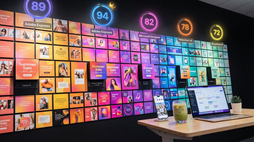
Social graphics have unusual constraints. They are seen small, quickly, next to competing content, and they usually carry type. That pushes the decision away from the most beautiful model and toward the most controllable one.
The rule that saves the most time: generate the picture, typeset the words. Almost every problem people have with AI social graphics comes from asking one tool to do both.
Key takeaways
- Ideogram 3 leads when the graphic itself must carry readable text.
- Nano Banana 2 is the fastest free option for backgrounds and lifestyle imagery.
- Always leave deliberate empty space for overlaid type.
- Consistency comes from a reused style block plus a template, not from luck.
- Batch by format, not by publication date.
What social work actually needs
Three things: a clear focal point that survives being seen at thumbnail size, enough contrast to stand out in a feed, and space where type can sit without fighting the image.
Fine detail is largely wasted. A subtle texture that looks superb at full size disappears entirely on a phone, which is why elaborate prompts often underperform simple ones here.
Platform by platform
Instagram rewards colour coherence across a grid, so consistency matters more than any single image. Generate square and vertical crops deliberately rather than cropping later.
YouTube thumbnails need extreme clarity: one subject, high contrast, few elements, and text that is legible at very small sizes. Ideogram 3 is the natural choice when the text is part of the image.
LinkedIn favours restraint — muted palettes, simple diagrams, clean photography. Pinterest rewards tall verticals with clear space for a headline and a strong single subject.
A bold horizontal image for a video thumbnail: a single espresso machine on a dark surface, dramatic side light, strong shadow, high contrast, subject on the left, the right half clean and uncluttered for a headline, saturated but not garish, no text
"The right half clean" is the clause that makes typesetting possible.
A soft square background for a carousel slide: flat sage green with a subtle paper texture, one small repeating leaf motif at very low opacity in the corners, large clear centre area, no text, print-like matte finish
Generate one background, then reuse it across every slide for instant coherence.
A tall vertical lifestyle photograph: a styled writing desk with a notebook, fountain pen and small plant, soft even daylight from the left, calm sage and cream palette, clear empty space in the lower third, natural colour, no text
Vertical formats need the empty space specified explicitly or the subject fills the frame.
Text overlays
For speed, generating text inside the image is acceptable — Ideogram 3 does it well. For brand work, add type afterwards so it matches your licensed typeface exactly.
Either way, decide the text position before generating. Retrofitting a headline onto a busy image is the most common cause of unusable output.
Brand consistency
Write a style block once: palette, light quality, medium, level of detail. Paste it into every prompt without editing. This does more for consistency than any feature in any tool.
Then finish everything in a template with your own colours, typeface and spacing. The generated image becomes one layer in a controlled design, not the whole design.
The two-layer method
Layer one is generated imagery with deliberate empty space. Layer two is your brand typography and colour applied in a template. Keeping them separate makes revisions trivial.
Working a content calendar
Batch by format. Generate ten square backgrounds in one session, ten verticals in another. Switching aspect ratios and subjects constantly introduces style drift and wastes time.
Keep a folder of approved backgrounds. A library of twenty reusable images with different headlines will carry a month of posting comfortably.
Decision table by team type
| You are | Start with | Add if needed | Why |
|---|---|---|---|
| Solo creator | Nano Banana 2 | Ideogram 3 free tier | Free, fast, covers most formats |
| Marketer in a small team | Ideogram 3 | GPT Image 2 | Text-led graphics with quick revisions |
| Agency | Adobe Firefly 5 | Midjourney for concepts | Approval workflows and content credentials |
| Small business owner | Nano Banana 2 | A template tool for type | Lowest cost and complexity |
| Video creator | Ideogram 3 | Nano Banana 2 | Thumbnails need legible text first |
| Ecommerce seller | FLUX.2 | Nano Banana 2 for edits | Product realism matters most |
Model availability, product features, pricing, and usage terms can change. Check the official product page before making a purchasing decision.
Frequently asked questions
Which AI tool is best for YouTube thumbnails?
Ideogram 3 if the thumbnail carries readable text, and GPT Image 2 for instruction-heavy compositions. Many creators generate a clean background and add the headline in a design tool.
How do I keep brand consistency across posts?
Fix a short style block describing palette, lighting and medium, reuse it verbatim, and apply your own typography and colours in a template afterwards.
Should text be generated or added later?
For anything a client sees, add it later in a design tool. Generated text is useful for quick concepts but will not match your brand typeface exactly.
What is the fastest workflow for a content calendar?
Batch by format rather than by date. Generate all backgrounds for one format in a single session with a shared style block, then typeset the set in a template.
Are free tools good enough for social graphics?
Usually yes. Nano Banana 2 handles most social imagery well, and Ideogram's free tier covers a lot of text-led work. Verify commercial terms before using output for paid client work.
Return to the pillar guide for the full comparison: nine tools across realism, text, editing, speed, commercial safety and cost.
Continue the series
The other chapters in the AI Image Tools comparison guide.